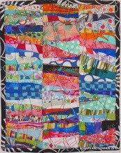
What is really missing is my ability to measure. I thought I had calcuated the borders so the centre medallion would end up at 33.5 inches, but no, it's only 32. That's a fair amount too small, even if you're like me and not too concerned about precision piecing. So what do I do next? A skinny border around the black and white print, which I was hoping would be the last border before the squares? cutting down all the squares (I really don't want to do that! Setting it on point and figuring out some setting triangles? This was supposed to be a quick quilt of 6 inch squares, and now its getting way too complicated. I've been starting at this for a week, and I'm stuck. Help!
thanks for all the great ideas. I also thought I could cut down the b/w border and sew on another wider one, although I'm stuck on the colour. keep those ideas coming!


.JPG)


.jpg)


8 comments:
Hi Brenda,
I like the skinny border idea. I think black or turquoise would look neat.
I love the wonky stars in the middle. Very cute.
Sylv
The course of least resistance is an additional inner border.
You could, however, take up the vertical seams in your 4-patches and then sew the 4p's together with larger than ¼" seams. It will make the squares into rectangles, but you've got the wonky thing going with the stars and making the outer border of wonky would actually be a pretty cool design element.
A bonus, if you embrace the wonk, is that your seams (& the resulting rectangles) don't need to be consistent, you just need to take up a bit here and there to make it fit.
You could remove the black and white border and replace it with a slightly wider one. That would be a minimum of ripping out.
Add another skinny border of the SAME black and white print. It would not "match up", so adds to the wonkiness. but it would be the same fabric, so maybe not look entirely like an additional border.
Good luck on meeting your own requirements of "right" and easy"! I've recently run into a few of those problems with projects too!
Add a little bit on to the squares, a strip in the middle. make them fit.
What about a skinny border of that pinky purply color in the upper left hand square if you have more of it? Then I'd put a dark green border around the outside of it all. I think a bright pink would look good with the black and white.
Oh, this kind of thing is ALWAYS happening to me...its why I have to be a liberated quilter ;)
Just a quick note to all of my Liberated Challenge quilters..I am SO excited!
Art Quilters Finance New Alzheimer’s Discovery!
Hey Brenda, post the new pic, I liked the idea you eventually came up with, the 1/2 square triangles are a lighter balance to the lighter delicate colours in the centre. glad I could help with the math . Hope the headaches gone.
Va;
Post a Comment