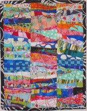
This is a preliminary layout of my blocks from 15 minutes play bee last September.
Initially I thought I was going to sash them in lime green, visible at top left, but I', liking the colourwash effect.
From this picture, I'm seeing too many blocks of navy, so I have to figure out how to soften that.


.JPG)


.jpg)


10 comments:
I think your layout looks great... there are some really light lights, so there should be some really darker darks. So pretty. I wouldn't sash it either... you lose the design with sashing.
Hugs
If you remove some of the navy blocks you will not have as much glow from the lights and warms. I like it.
I'll tell you what I think.
I think it's great. Leave it alone. Finish it up as it is. Wanda is right. You need the darks to make the lights pop.
It's wonderful! I love it.
I am liking it very much!!
glen
Ok maybe it because it is late and I'm tired but when I look at this quilt I see a wonderful cool pool of water surrounded by a beach and brightly colored houses set against an azure sky- in other words it is gorgeous! I wouldn't change a thing and if this isn't your vision I understand. But I am loving what I'm seeing - take care!
I agree with the rest, it looks great, dark blues and all. I see a Spanish village on a hillside bathing in the sunset. I might be influenced by my longing for being there right now instead in my grey and wet hometown though..
Stop pondering and start stitching - it's WONDERFUL!!
LOVE IT!
I like what you have so far. The dark is good. What a fun project.
Don't over think it :0) it is quite striking.
Nicely done,
Happy Sewing
beautiful. I agree w above comments: no sashing!
Post a Comment