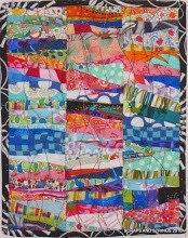
I've been pulling out half-started (as opposed to half-finished) projecfs this week. I was piecing these 9-patches from a very pink jellyroll I was given. I used some whites, but also other lights in the alternating blocks. I think I'm having some value problems. I've also made some frame squares for the alternating blocks, using a green with pink print in the jelly roll. This is meant to be a children's hospital donation quilt. I'm not loving it over here. How does it look from over there? What could I do to fix it? How do plain blocks in the butterfly print look instead of the other ones?

I also made some two-rail fence from my box of scrap bricks as a leader-ender project. I'm thinking I'm going to go with these large blocks that will finish at 16 inches, and maybe make a 9 patch of the rail fence. Certainly lots of oldies in here, but sometimes I have a lot of bricks of one colour, so I can pull together a block in a colourway.

These bunny blocks fall into the "they don't look like you" category that I saw another blogger post about recently. They're for a guild challenge. The ones at the left are paper pieced, with the eyes and nose embroidered. The solid blocks use a bunny print. I've heard some complaining and exclaiming by other guild members about the paper piecing, which is not my favourite technique either, but this IS a challenge, and it certainly challenged me to keep my patience. I only had to rip out one seam, which is a record for me when it comes to paper piecing.


.JPG)


.jpg)


11 comments:
the 9patch quilt is sweet. I think you're overstressing about it. like the first, softer approach. no butterflies.
I agree with Tonya. It looks great just like it is....no butterflies. It is sweet and light!
Your rail fence blocks look good too.
I agree, I like the first one. No butterflies!
Love the rail fence! I like the first one when you use the blocks with the green centers....
hmmm, I kinda liked the butterfly blks....... gave it life, vibranceya nd movement.......
And I think the rail fence blks look really good.
I like the plain blocks with the pink nine patches. The other way seems too busy.
I think the framed ones need a stronger center to work, but how about using a diagonal row of the butterfly print (which I love) and the frames? I love the hot pink nine patches, but think the other blocks are too soft.
I like the first ones with the green dot. Maybe add some more vibrant greens into the mix. For an all out effort, applique some flowers and leaves on a light border :)
I've used a snowball block with nine patch before but I think your framed blocks work well. Keep the large print for a border and/or binding.
For the butterfly quilt why not put the alternate square within a square blocks on the outside of the quilt as part of the border and the alternate white blocks throughout the middle of the quilt?
Just a thought...
Make sure to show us pics of the finished product!
Tricia
Hi Brenda, I LOVE scrappy soooo I'm thinking that I love this - however, you are right about the value...maybe try adding some more 9 patches that are less contrasting...
Valerie
http://www.pastimesonline.ca/vals-quilting/
Post a Comment