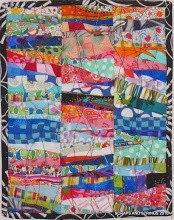
 I've been making scrappy four-patches from the leftovers of the 2 inch square box as a leader/ender project for the last few months. I've made about 160 of them, finishing at 3.5 inches, and they are very scrappy, using 1980s and 1990s fabrics (these are ones my mother cut years ago and then never used them.) Some have light/dark contrast, some match, and others just clash. Scrappiness at its best and worst, I suppose.
 So, armed with courage from making precision blocks with Quilt Pixie at the Friday Block party, I cut into other 1980s and 1990s scraps from my mother, and made some hourglass blocks. Which layout do you prefer? Number 1 above, with alternating hourglass and four patches.
Here's Number 2, with light squares inside the dark diamonds, and showing up the dark star points.

Or layout Number 3, with the four-patches inside the dark squares, giving me an on point design?
 My goal here is to get a throw or single-sized quilt top, using only scraps from stash. No yardage here, no funky current prints (see previous posts) just lights and darks and the scrappy four patches. I'm open to another path altogether. This will make quilt number 5 or 6 from that box of thousands of two inch squares. Amazing what one can do with little bits of fabric, isn't it?

Or layout Number 3, with the four-patches inside the dark squares, giving me an on point design?
 My goal here is to get a throw or single-sized quilt top, using only scraps from stash. No yardage here, no funky current prints (see previous posts) just lights and darks and the scrappy four patches. I'm open to another path altogether. This will make quilt number 5 or 6 from that box of thousands of two inch squares. Amazing what one can do with little bits of fabric, isn't it?


.JPG)


.jpg)


18 comments:
It takes a lot of patience and persistence to get this far! I vote for the look of Option 2. Maybe someday I will try this project.
I too vote for number two! it looks so nice!
I really like #2. It allows you to enjoy all the older fabrics, but still gives you a place to rest your eyes. I'm also a stars lover, so the hint of Ohio Star is a plus for me.
Definitely #2
I have not read anyone else's answer!!! I really think that #1 is my favorite. I think scrappy quilts are snuggly and comfy and the first one just feels like a great cuddly quilt!!
So, #1 is my choice!!
I decided on number 2 before I read the comments. I think it's because of the stars. It's amazing what you can do with tiny scraps.
I think that #1 looks the scrappiest, and shows your fabrics off the best. #2 and #3 have too much "blank space" (the light squares) which might be a little plain looking.
But whatever you pick, it's gonna look great!
I really like option 1! Isn't it funny, I recognize some of your fabrics from a queen sized quilt I made a few years ago from 2.5" squares! (In my flickr photos). I just love scrappy quilts. I raided my Mom's stash for my fabrics too. Good luck!!
Definately number 2, can you see the secondary stars? It's the calmer of the three. I think is a good thing for scrap quilts to have some place for the eye to rest.
You inspire me to keep adding to my box of little scrap squares.
Lois
I'm inspired!
I actually like #1 best as well. I like scrappy quilts to have lots of colour and variety. #2 comes second, but compared to #1 I like the lesser amount of white space (today anyway--tomorrow I might have another opinion!). You've been busy!
I like number 3 best - the white space gives my eye a break, and to my taste - looks cleaner and fresher. But they're all lovely - truly!
I like No. 2; it feels the most comfortable to look at from my point of view. Good luck, you have more patience than I do, that's for sure...Kathy
I like #2. I am encouraged with what you have done with all the four patches.
I vote for #1 - for a scrap quilt it uses the most variety of fabric. #2 and #3 have too much "white space" for me. Good luck - I need to get into that box of scrap squares and this is an inspiration!
personally i love number one the best, but i'm sure whichever version you make will look fabulous. i'm just happy to see you trying out different versions!!
Option #1 for me. i like the liveliness as well as the business.
I like option #1 as it's more scrappy. I do like option #2 too, but find with all the white it loses it's wonderful scrappy feel. Great idea to mix the 4 patches with hour glasses, I really like that.
Cheers,
Michele
Post a Comment