
 Thanks for all your comments on the previous post. I've replaced the black star with a neutral one, and added some small splashes of red. Above is a horizontal arrangement without the side borders, which didn't fit on my wall, and below is a vertical one.
 I like them both, but I don't want this to be too big. Right now its about 36 wide, nearly square in the top layout, a bit longer in the bottom one.
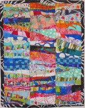


.JPEG)


.JPG)


.jpg)


10 comments:
I'm liking the first (horizontal) version better...
WOW - great work!!!
The new star fits in much better. I like both arrangements. I guess it depends on where you want to hang it.
I like both, guess I have a slight preference for the horizontal version The red looks great, and your borders are wonderful.
I like that new star much better, and love that you scattered some red around the rest of the quilt. I like both arrangements, too. This is a cool quilt!
i love those little sparks of red in there. I admit a preference for the top pic - I like it that the altogether isn't so far away. really coming along great!
I prefer the vertical to the horizontal. Don't know why but I just do. Yes - that star is definitely better than the previous one, although that one is great too. Hope you are putting it in the Parts Dept.
Both ways are great, but I like vertical best and the new star is perfect! :)
I like the horizontal better, but the red star is really giving it the little bit of extra with the red "dots" in either arrangement.
I really like them. The bottom one is probably my favorite.
I really like the lettering style you have used on this piece. Very creative!
Post a Comment