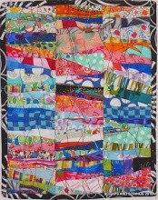
My mother and I put our modern floral applique blocks on the design wall a few days ago. We have 39 finished or nearly finished.
Here's option no. 1, a row version:
Yes, I know the bottom left ones aren't done. And we haven't played with the colour layout at all.
Option No. 2
This one would mean adding another row at the bottom, or taking one away. My mom likes this one, but I'm not sold on it. I prefer this version:
We'll probably have to make another row for the top, or lose the bottom row. We're thinking about putting in a hand-dyed sashing around the centre four flowers, and then more sahing around the next round, and the next. What do you think?
I've been reading all your comments so far, and I want to clarify the sashing bit. It would be handdyed brights, and probably really narrow, say 1/4 inch, so it would appear like piping.


.JPG)


.jpg)


17 comments:
I like the sashing idea. I think the black needs to be set off and sashing will be perfect.
Color?
I vote for the first version and I like the idea of no sashing and hand dyed boarders.
There is my 2 cents. :-) Your pieces are beautiful!
Ooooh, most definitely the last setting!
I'm all for #2! It looks very striking. This is such a beautiful project to see come together. I'm so glad you can create something beautiful with your mom!
I really liked the first one, until I saw the last one. I'd go for the last for sure~! Love this quilt, no matter how you set it.
I like your version to, very nice work the colors just pop out on the black background , did you turn the edges over I believe so ,the pattern is pretty smooth I have a problem when they have to many curvs, I invite you to my blog when you have time between quilting LOL.
I'm not crazy about the third option as is but with sashing I think it would be perfect.
I truly like the third option, especially when you could turn the last row at the bottom the same way as the other rows - and add another row at the top. Sashing - not so sure about it, if you use hand-dyeds for it, it might detract from the blocks? Just my 2 cents; don't you love all those very different opinions ??? Anyway, thanks for sharing - and asking for opinions ;-))
I prefer the last version as it is the least predictable of all three. Have you considered leaving off the sashing, and instead put a narrow border first around the middle 4 blocks, then the next row, and the outside?
I love option # 3. What a cute quilt. I've been looking for something to do with my hand dyes. Did you make up this pattern? Or where can I find it?
I see I didn't read the post fully, and that you have thought of that! Oops...
Hi Brenda,
I do like option #3. It has a balance that I'm just not seeing in the other two. It has a focus in the center, a better rhythm. The extra top or bottom rows could look "right" if they keep with the theme. I don't know about the colored sashing, but you could try that out on the design wall first to see how it looks. Good look. I love the "hot" colors on the black. Really enjoy your blog.
No. 3, no question.
I'd need to see some of the sashing ideas in action ... I'm not visualizing it well.
LOVE the effect of the glowing flowers!!!
I really like #3, it isn't quilt so symetrical, like the flowers.
I like the third one best. I think the sashing strips will be perfect. Great job.
Looking great Brenda! I like your last setting too... the third one... Love it! 8-)
If you need yet another opinion, I like the third version. Your Mom's favorite reminds me of the traditional quilts in my favorite quilt book, so not as "modern" and unexpected as the third version. So cool that you can play with your Mom like this... lucky girl!
Post a Comment