
I'm working on a banner for a chapel at the nursing home my sister works at. I'm using a variety of dark batiks in greens and blues and purple against a light batik, all fabric donated to the cause by my mother. This is one layout above, but its a bit too
blocky.

Here's another go, using bias strips from the scrap bag to fill in the blank spots. I'm probably going to use that fabric I've pinned up as binding as bias strips, but I haven't cut into it yet. The letters don't look as dark in real, but I'm going for good contrast, since this has to be legible from from the back of the chapel. My letters are 3 to 4 inches high, bigger than my usual letters, and made using 3/4 and 1.5 inch strips. I'm happy with where it is going, except for one thing: I don't know how big this is supposed to be! I'm waiting to hear the pulpit measurements (where this is going to hang) before I can proceed.

one more thing: the binding strip is from an old print donated by dear mother, called One Universe by Hoffman. It's sort of a sunset print in lots of colours. I'm not sure if I'm going to use it or not.
So here's another go at it (I'm still waiting for the size, so that hasn't changed) with the One Universe fabric all around as a binding. I'm liking that more and more. I pulled in some of that print with tiny squares between the letters, and they'll get tinier still after the seam allowance comes off them. I've sewn the letters into word blocks, but none of the words are attached to each other yet, so I can move them around. I also put a strip of the print with the checked bias strip to see how it looks, but since its not on bias, it doesn't bend as nicely.

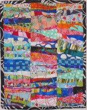
 I'm working on a banner for a chapel at the nursing home my sister works at. I'm using a variety of dark batiks in greens and blues and purple against a light batik, all fabric donated to the cause by my mother. This is one layout above, but its a bit too blocky.
 Here's another go, using bias strips from the scrap bag to fill in the blank spots. I'm probably going to use that fabric I've pinned up as binding as bias strips, but I haven't cut into it yet. The letters don't look as dark in real, but I'm going for good contrast, since this has to be legible from from the back of the chapel. My letters are 3 to 4 inches high, bigger than my usual letters, and made using 3/4 and 1.5 inch strips. I'm happy with where it is going, except for one thing: I don't know how big this is supposed to be! I'm waiting to hear the pulpit measurements (where this is going to hang) before I can proceed.
 one more thing: the binding strip is from an old print donated by dear mother, called One Universe by Hoffman. It's sort of a sunset print in lots of colours. I'm not sure if I'm going to use it or not. So here's another go at it (I'm still waiting for the size, so that hasn't changed) with the One Universe fabric all around as a binding. I'm liking that more and more. I pulled in some of that print with tiny squares between the letters, and they'll get tinier still after the seam allowance comes off them. I've sewn the letters into word blocks, but none of the words are attached to each other yet, so I can move them around. I also put a strip of the print with the checked bias strip to see how it looks, but since its not on bias, it doesn't bend as nicely.


.JPG)


.jpg)


11 comments:
Looks really good! It's hard to know about real life, but in the photo, that binding looks great. It makes it more lively without calling attention to itself.
The first thing my grandmother said every morning when she woke up was "This is the day the Lord has made, let us rejoice and be glad in it," so when I was a teenager I made a cross stitch with those words for my mother.
the bias pieces "filling in" around the words remind me of palm branches being waved, or maybe spring flowers... I think the high contrast and size will make this very readable for residents.
How lovely, and one of my favorite Bible verses.
I really like how this is coming together. It seems very readable on the monitor - good contrast. The binding fabric is good too. And I really like the little bits of color between the words - it makes it more joyful!
Looks great! I have only one tiny suggestion, which you may be planning anyway: a little white space after the "e" in "made".
It's looking wonderful! That's one of my favorite Bible verses, too.
I, too, love your third photo, with the colorful binding and the little bits of bright fabric scattered throughout.
You are really going to town with the pieced words! This one is really nice And I love the border.
Enjoying watching your words grow and now this lovely banner.
wonderful banner...great use of color
the houses in the previous post was so fun too!
What an awesome banner! It's going to look GREAT!
Cheers,
Dionne
Post a Comment