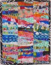
I'm regretting the machine quilting on this project.
I had a vision of all over straight line quilting
so it wouldn't distract from the words,
but I don't think it worked.
What do you think?
I'm going to take it to my guild meeting tonight for in person reviews.


.JPG)


.jpg)


13 comments:
I think the scale of your quilting design is what is competing with the letters. If you added more straight line quilting, cutting the distance between your existing lines in half, I think the stitching would fall into the background and your words would appear more dominate.
I agree with Sophie....see how it looks after adding more straight lines....right now its too blocky and fights the letters
I usually hate to jump on the bandwagon, but agree with the first 2 posts : more quilting needed and all will be well. Be Merry.
In my experience stitching the lines closer together (like a presser foot apart or so) and only in one direction, makes them blend more into the background as you don't get the "puffyness" that competes with your design. I do a lot of them..
I have to agree with the others. Love the colors on the words.
What Sophie and the others said. Right now the quilting is competing with the letters. You need more of it to push it in the background and let the letters shine.
At least you don't have to take stuff out! Good luck,
Lynne
(Millie is the cat)
yes, make the quilting lines dense. Its the poof not the quilting that is distracting.
I agree with the others. More quilting lines will help.
I don't think it is that bad. I like the quilting. But if you don't want the focus to be on the quilting then I would add more straight-line quilting. I guess what the majority has already advised. :)
Cute quilt though!
I'm with the majority :-)
It's a beautiful quilt !
yup needs just a bit more quilting but it is lovely!
MORE lines....MORE....MORE.....M-O-R-E...!!!!
Other than that....I.LIKE.
It needs more lines, then they would not be so stand out noticable! Really.....!
Post a Comment